Fill out my online form.


It is also a maddening beast, and if you don’t know the “ins and outs” as I do, you may sacrifice a bit of your sanity in the process. Like… If you’ve ever screamed into the void because your text box suddenly disappeared from the page, welcome. Pull up a chair. You’re one of us now.
Before we get too deep into this gloriously unhinged list of glitches, let’s give InDesign the respect (and side-eye) it deserves.
Adobe InDesign is Adobe’s powerhouse for page layout and desktop publishing. While Photoshop handles image manipulation and Illustrator wrangles vectors, InDesign is the friend you call when you need to build multi-page documents, design print-ready layouts, or create interactive PDFs that don’t look like they were made in 2003.

It’s the tool behind magazines, brochures, books, catalogs, flyers, resumes, and even fancy restaurant menus (you know, the kind printed on thick paper that makes you feel poor). InDesign specializes in organizing and flowing text, aligning elements with maddening precision, and integrating visual content created in other Adobe apps.
So, yes — it’s essential. If you’re in publishing, marketing, design, or just enjoy yelling “WHY ARE YOU DOING THIS TO ME” at your screen every few hours, InDesign is for you.
Now, back to our regularly scheduled tantrums.
 You’re typing. Everything seems fine. But then—suddenly—your letters are coming in like a right-to-left poltergeist has possessed them. The first character appears on the right side of the text box. Then the next one bumps it to the left.
You didn’t ask for this.
You didn’t enable anything.
You didn’t even know World-Ready Paragraph Composer was a thing.
And yet here you are, accidentally designing a brochure in Arabic layout mode, trapped in InDesign’s multilingual panic room.
Let’s uncurse your project:
Scroll to “Adobe Paragraph Composer” or “Adobe Single-line Composer”
Select either one
This will instantly override the World-Ready setting and restore left-to-right behavior
In Justification > Composer, switch it from World-Ready Paragraph Composer to Adobe Paragraph Composer
Click OK to save and apply
Pro Tip: If you do need right-to-left layout support (Hebrew, Arabic, etc.), the World-Ready Composer is your friend.
But if you don’t? It’s the design equivalent of handing you a wrench when you asked for a pencil.
You’re staring at the page, absolutely certain there was copy in that text box five seconds ago. Now? Gone. Vanished. Erased from existence. You click around in disbelief, questioning your memory, your sanity, and maybe your entire career.
But wait — it’s not deleted. It’s just… somewhere.
Maybe the text is overset.
Maybe it’s behind another element.
Maybe the whole frame is sitting on a locked, hidden, passive-aggressive layer that refuses to be acknowledged.
This is InDesign at its gaslighty-est:
“Are you sure you even typed anything?”
Yes, InDesign. I am sure. Now stop playing games.
Here’s how to locate your missing text before you start questioning reality:
Look for a red plus sign (+) in the lower-right corner — this means there’s text, but it doesn’t fit in the box
Look for hidden or locked layers — especially ones mysteriously named “Copy” or “Don’t Touch”
Unlock and toggle visibility as needed
Pro Tip: Use the tiny triangle to expand each layer and see individual objects
Check Object Arrangement
Right-click the text frame > Arrange > Bring to Front
It may be hiding under another object like an image or a rogue white box
Use the Story Editor
Select the text frame and go to Edit > Edit in Story Editor
This lets you view the raw text in a separate window, even if it’s completely overset or off the page — perfect for spotting “invisible” content
Still can’t find it? Check the pasteboard, the master pages, or the alternate layouts tab you forgot existed. Or just accept that InDesign’s playing hide-and-seek with your sanity again.
Oh look — it’s the pink highlighter of doom! A bright neon warning that your font is “missing.” Except… It’s not. It was working just fine yesterday. Or five minutes ago. It’s still installed. Still active. Still very much alive on your machine. But InDesign? InDesign has decided to gaslight you.
Sometimes, restarting the app makes it see reason. Other times, you have to reboot your entire system, uninstall and reinstall the font, sacrifice a printer cable to the Adobe gods, and lower your expectations for how this day will go.
It’s not just annoying—it’s catastrophic when you’re on deadline and suddenly your brand font is replaced with something that looks like a 1997 greeting card.
<p “>Here’s how to un-haunt your fonts and get them back into the document where they belong:
If it’s showing as active, try toggling it off and back on again
If you’re using system-installed fonts:
Check Font Book (Mac) or Fonts folder (Windows) to confirm it’s installed and enabled
Sometimes, just re-validating the font works (Font Book > Validate Font)
Clear InDesign Font Cache
If the font is installed but still showing as missing, your InDesign font cache might be corrupted.
Quit InDesign and manually delete the cache files:
Mac: ~/Library/Caches/Adobe InDesign/Version [xx]
Windows: C:\Users\[YourUsername]\AppData\Local\Adobe\InDesign\Version [xx]
Then relaunch InDesign. You’ll be surprised how often this solves the issue.
Check the Document’s Font Embedding
If you received the file from someone else, it may reference a different version of the font or one that isn’t fully embedded.
Solution: Reapply the correct local version and save the file anew.
Avoid Using Fonts from Sketchy Sources
That free font site? Yeah… probably corrupt.
If you’re downloading fonts from third-party sites, make sure they’re from trusted, verified sources (Google Fonts, Font Squirrel, Adobe Fonts, etc.)
Export to IDML as a Last Resort
Corruption still lingering?
File > Save As > InDesign Markup (IDML)
Open the IDML file, save it as a fresh .indd
This often shakes out hidden font issues embedded in the original file structure.
Pro Tip: Create a “Fonts” folder in your packaged file every time you hand off work to a client or printer. This avoids those dreaded “Please send the fonts!” emails at 5:01 PM on a Friday.
All was flowing beautifully — a threaded story cascading gracefully from page 2 to page 10 — until one day, it just… stops. No warning. No goodbye. The blue out-port box sits there, smug and unresponsive. You try to drag the thread to the next frame, but it’s like trying to reunite exes at a wedding. The frames refuse to talk to each other.
You sigh, unthread everything, thinking you’ll start fresh. And what do you get? Ghost links. Broken chains. Text boxes haunted by connections that no longer exist but still refuse to die. You didn’t ask for this drama. You just wanted a simple text wrap. Instead, you’re waist-deep in the breakup saga of two text frames who “just need space.”
Here’s how to resolve the situation without rage-quitting your career:
Turn on Frame Edges
First things first: make sure you can actually see what you’re doing.
Go to View > Extras > Show Frame Edges. This will help you spot rogue connections or overlapping boxes you missed.
Use the Selection Tool, Not the Type Tool
You can’t connect frames properly with the Type Tool.
Switch to the black arrow (Selection Tool) before you click the little blue box.
Check for Overset Text
That tiny red plus sign in the out-port? It means your text doesn’t have enough room. Either resize the current box or link it to a new one to continue the flow.
Break the Chain Gracefully
If things get really gnarly, Alt (Option) + Click the in-port or out-port to remove just that one connection without disturbing the rest of your layout. It’s like cutting the right wire in a bomb movie — do it carefully.
Rebuild from a Clean Slate (but smarter)
If all else fails, copy your uncooperative text into a fresh text box.
Pro tip: paste it into a new master-threaded setup starting on a blank spread. This isolates the drama without dragging the rest of your layout into the chaos.
That one rogue line has decided it’s better than the others. It levitates above the rest of the paragraph like it’s been raptured mid-layout. You didn’t apply a baseline shift. You check the character settings. You check the paragraph style. You reset everything short of sacrificing a goat under a full moon. Nothing works.
The text has chosen chaos — and now you’re selecting each character one by one like a typographic hostage negotiator, trying to talk them back down to earth.
Here’s how to bring your text back to baseline reality:
Highlight the Offending Text
Select the problem line (or better yet, the entire paragraph) with the Type Tool.
Clear Overrides
In the Paragraph Styles panel, right-click the applied style and choose Clear Overrides.
This will wipe out rogue formatting that’s sneakily applied on top of your style.
Check the Character Panel
Open Window > Type & Tables > Character and look at the Baseline Shift field. If it’s anything other than 0, your text has indeed gone rogue.
Set it back to 0 pt, and your floating line should return to the fold.
Look for Hidden Gremlins
Still not working? Turn on hidden characters (Type > Show Hidden Characters) to see if there’s a line break or span of text carrying a different style that includes a shift.
Nuke It from Orbit (Optional but Therapeutic)
If all else fails, copy the clean text into a new text box with no styles applied. Start fresh.
Sometimes styles get corrupted, and no amount of reasoning will help. It’s not you. It’s InDesign.
This one is like Russian roulette for your reputation. Everything looks perfect in InDesign — sharp, styled, color-correct, your fonts are flawless, your layers are clean. You hit “Export to PDF” with the confidence of a seasoned pro… and then open the file only to find it looks like someone ran it through Microsoft Paint with a potato.
The spacing is off. Transparencies flatten like pancakes. The carefully placed 300 dpi image? It’s now blurry, sad, and vaguely offended. Your masterpiece has been reduced to meh. Why? No one knows. It’s just… InDesign being InDesign.
Here’s how to improve your odds in the grand PDF casino:
Set the Right PDF Compatibility Level
In the Export to PDF dialog (File > Export > Adobe PDF [Print]) under the General tab, you’ll see an option for “Compatibility.” This controls which version of Acrobat the PDF will target (and what features it can support).
PDF 1.4 (Acrobat 5): Flattens transparencies. Avoid this unless your printer demands it or you love chaos.
PDF 1.5 – 1.7 (Acrobat 6–8): Supports live transparency, layers, and advanced effects.
👉 Use PDF 1.6 or 1.7 for the most flexibility and fewest flattening issues.
Pro Tip:
Unless you’re exporting for a 1990s printer or time traveling, go with PDF 1.6 — it preserves transparencies and plays nicely with most modern RIPs and workflows.
Use the “High Quality Print” or “Press Quality” Preset
File > Export > Adobe PDF (Print)
Then choose either High Quality Print or Press Quality in the export dialog.
These presets preserve resolution, embed fonts, and reduce nasty compression surprises.
DON’T Use “Smallest File Size” Unless You Hate Yourself
That preset aggressively downscales images and flattens transparencies for screen use only.
It’s the reason your crisp photo now looks like it was shot on a flip phone in 2004.
Check Your Compression Settings
Under the Compression tab in the PDF export dialog:
Set image quality to “Maximum”
Downsampling should be set no lower than 300 ppi for print
Preserve Layers & Transparency
If your document uses transparent PNGs, drop shadows, or layer effects, make sure “Create Acrobat Layers” is checked (under “General”) and Transparency Flattener is set to High Resolution under “Advanced.”
Preview Before Panic
Open the exported PDF in Adobe Acrobat Pro, not just your browser. Chrome and Preview on Mac render things weirdly. Always check your file in a program meant to interpret it correctly.
If All Else Fails: Print to PostScript > Distill
If you’ve tried everything and InDesign still spits out a cursed PDF, try exporting to PostScript and running it through Adobe Distiller. Yes, it’s old school. Yes, it still works.
You set your bleed to 0.125″ like a responsible adult. You checked it in the Document Setup. You double-checked it in the Export panel. You even manually previewed it in Acrobat like the print-savvy pro you are.
Then the email comes in.
“This file doesn’t include bleed.”
You look at the file.
You look at the printer’s email.
You look at the bottle of wine in your fridge.
One of them is going down tonight.
You were sure you did everything right—but somehow, your precious bleed is MIA, and now your printer thinks you’re new here.
Here’s how to make sure your bleed actually shows up and keeps your sanity intact:
Set Bleed in Document Setup
When you create your document (or at any time):
Go to File > Document Setup
Click the Bleed and Slug dropdown
Set Top, Bottom, Left, Right to 0.125 in (or your printer’s specs)
Make Sure Your Artwork Extends Into the Bleed Area
It’s not enough to set the bleed—you have to use it.
Any background colors, images, or design elements that should run to the edge of the page must extend past the trim line into the red bleed zone
Set Bleed When Exporting
Go to File > Export > Adobe PDF (Print)
In the Export Adobe PDF window, click the Marks and Bleeds section
Check “Use Document Bleed Settings”
Do not forget this step—this is what actually includes the bleed area in the exported file
Add Printer’s Marks If Requested
If your printer needs crop marks or registration marks:
In the same Marks and Bleeds panel, check “Crop Marks”
Double-check that bleed and crop marks don’t overlap awkwardly
Preview Your PDF in Acrobat
Open your exported file in Adobe Acrobat Pro
Turn on TrimBox and BleedBox view via Print Production > Output Preview to verify the bleed is present
If you don’t see anything past the trim line, your bleed didn’t make the cut
Pro Tip: Always export a PDF/X-4 or Press Quality PDF for final print—these formats preserve bleeds, transparencies, and color profiles without throwing your file under the bus.
You’re not fooling anyone.
We’ve all got a folder (or three) littered with files named things like:
Final_v2.indd
RealFinal_THISONE.indd
FinalNoReallyForPrint_ACTUALFINAL.indd
Final_USE_THIS_ONE_FOR_REAL2.indd
…and deep down, we know the truth: there will never be a final file.
Not because you’re indecisive. But because InDesign always finds something. A style misfire. A bleed adjustment. A last-minute font panic. A client who says, “Just one more tiny tweak.”
The result? A digital paper trail that reads like a designer’s slow descent into madness.
Here’s how to reclaim your dignity and avoid naming shame:
Use a Versioning System (That Isn’t Emotional)
Stop naming files based on feelings. Instead, number them cleanly:ProjectName_v01.indd, v02, v03, etc.
No adjectives. No all-caps breakdowns. Just numbers.
✅ Bonus: you can easily track which version was approved or printed.
Include Dates If You’re Working Across Multiple Days
Add the date like a timestamp:ProjectName_v04_2025-07-27.indd
Useful for freelancers juggling client rounds or 3 a.m. tweaks you won’t remember tomorrow.
Save “Final” for the Packaged File
Only use “Final” on the version that’s actually going to the printer or client — and package it.
Inside that folder, include a PDF preview, fonts, links, and your actual final .indd.
Example: ProjectName_FINAL_PrintReady_2025-07-27.zip
Keep a “Working Files” Folder to Hide the Chaos
Put all the messy drafts in a subfolder named “Working” or “Versions” so your client never sees the evolution from Initial Draft_v1 to Final_Updated_ForRealSeriously.indd.
Use Comments in the File Metadata
File > File Info > Description
Leave a note to yourself or teammates like “Contains unapproved client edits” or “Ready for export – round 2”
You know that mystery gap between paragraphs? It’s probably a non-breaking space, a soft return, or an invisible character having an identity crisis.
How: Go to Type > Show Hidden Characters.
Suddenly, you’re Neo in the Matrix—everything makes sense, and you can stop blaming your mouse.
“Layer 3 copy copy copy” isn’t helping anyone. It also doesn’t help when everything disappears and you’re digging through a 48-layer stack to find that one white rectangle ruining your layout.<br”></br”>
Pro tip: Name layers like “Images,” “Text Overlay,” “Background,” or even “This One Is Causing Problems.” Be your future hero.
Is your style not applying correctly?
Still broken? Create a new style from scratch and then reapply it.
Some styles get corrupted—don’t try to fix what’s already feral. Just start over.
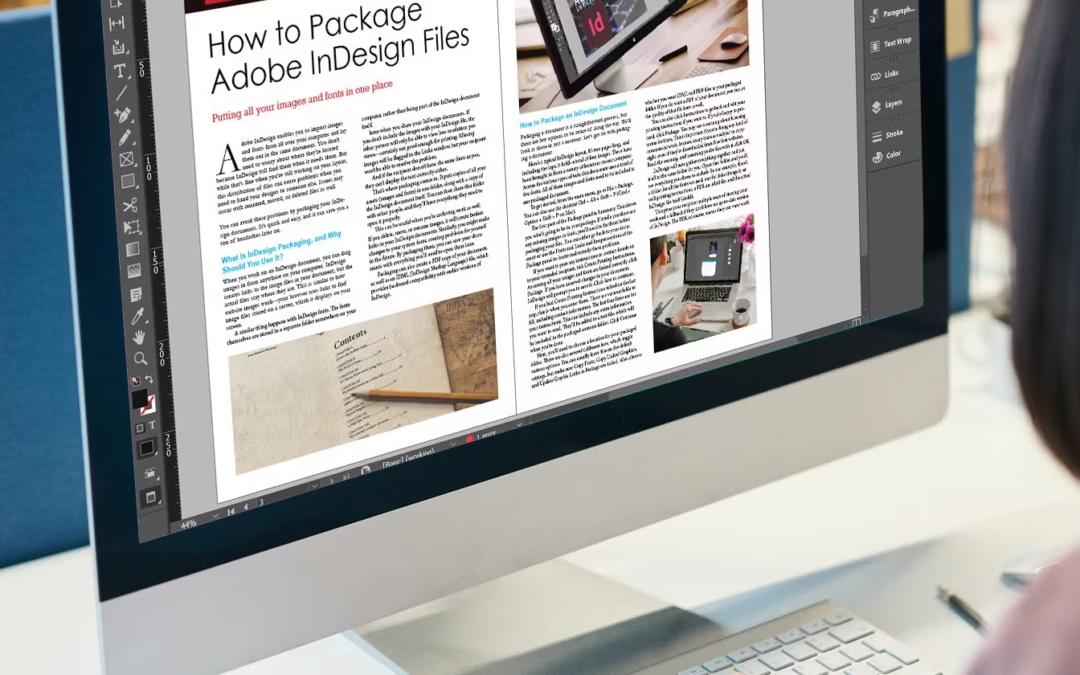
Fonts, links, instructions, your will to live — all wrapped up for printers who will call you at 4:55 PM asking where the fonts are.
Before you send your file to anyone:
File > Package
This bundles your fonts, links, images, and a .txt summary. Printers love it, prepress teams need it, and your future self won’t get an email that says, “This font isn’t embedded.”
Bonus: it also makes you look like you know what you’re doing (even if you just yelled at your screen).
It’s the digital equivalent of “turn it off and back on again” — but for demons. Often fixes mysterious corruption that no mortal can explain. Your file is acting haunted. Text boxes won’t behave. Images keep unlinking.
Fix:
File > Save As > InDesign Markup (IDML)
Open the IDML file—it basically “resets” the InDesign file structure.
This often clears out corruption that would take hours to find manually. Think of it as holy water for your layout.
That little red dot in the bottom left corner? That’s Preflight crying out for your attention.
Window > Output > Preflight
It’ll tell you about missing fonts, unlinked images, overset text—stuff that turns into real problems at the printer.
Set up a custom Preflight Profile to avoid being caught off guard again.
Yes, yes, yes. Despite the glitches, the tantrums, the pink-highlight betrayals — we still use it.
Why? Because deep down, under the rage and ruined text wrap settings, InDesign is still the best tool for the job.
It’s the software equivalent of a toxic best friend. It makes you cry sometimes, but you still invite it to every project.
Drop it in the comments or just email me a screenshot with the subject line “WHY.”
I’ll light a candle, send a hug, and possibly forward it to Adobe with zero context.